Unit 2 (October/November)
Domain and Range: The domain of a table, graph, set of numbers, or an equation is simply the list of x-values (or 'inputs'), while the range is the list of y-values (or 'outputs').
Domain and Range simple examples
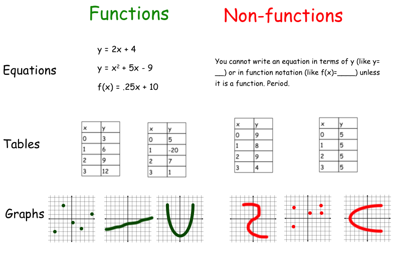
Functions: A graph, table, equation, or set of points is considered a function if and only if every input has one and only one output. In other words, every x value has one and only one corresponding y value. For example, if I plug in 5 for x on a graph, I get one point (like (5, 7) ). See below for examples of functions and non functions:
Function notation: Function notation is simply a way of writing the equation for a function. Instead of writing the linear equation y = 3x + 2, you would write it as f(x) = 3x + 2. The reason we do this is simple. A line is a function if for every x value, you get one y value. So, if you have an equation (like 3x + 2) and plug in a value for x, you only get one value for y. We can therefore say that "y is a function of x". Taking out all of the words in that quote we get y = f(x). Since y = f(x) (y is a function of x) that means we can use the two terms y and f(x) interchangeably. But why bother???
Take the equations y = 3x + 2 and f(x) = 3x + 2 for example:
Take the equations y = 3x + 2 and f(x) = 3x + 2 for example:
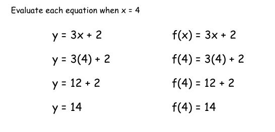
As you can see, the work is the same except for the left side of the equation (which really isn't work at all). However, in looking at the left equation, what can you infer, or tell, by looking at the solution? You can see y is 14. That is it. On the right function notation equation, we see the function is 14 when x is 4. We see all of the information we could possibly need. There is no guessing what value was plugged in for x. There is no guessing whether or not the equation is a function. Function notation tells you both of those.
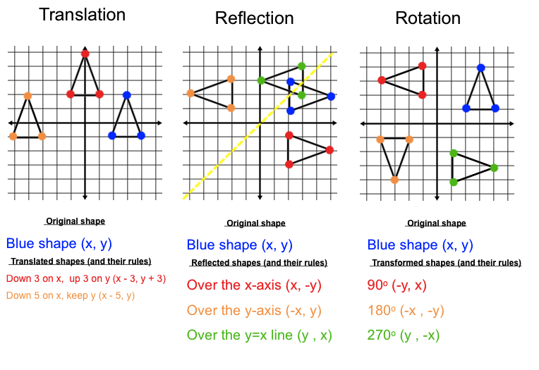
Coordinate Transformations: Coordinate transformations is a mathematical way of saying the 'twisting, turning, and moving of points'. For example, in 7th grade you learned the transformation called dilation when you multiplied your pixel characters by a common scale factor (pupils dilate or get larger/smaller). The three main transformations we will go over in Algebra are below. Note however that there are an infinite number of "rules" that can be made because there are an infinite number of transformations. For example, I can reflect a point over the x-axis, y-axis, x=2 line, x = 5 line, y = 7 line, etc etc....
The focus of this lesson will be two fold; how do you perform a given transformation, and rule creation. You may be asked to create a rule, for example, to explain and point being rotated 450 degrees.
Translations, Reflections, and Rotations Explained
Translations, Rotations, and Reflections applet
Composite Functions: Recall that a composite number is a number that has factors besides one and itself. A composite function is a function that is made up of more than one function or equation. Basically, you are substituting one function into another function. For example, if given f (x) = 2x + 1 instead of being asked to find f ( 3) and plugging in 3 for x, you may be asked to find f ( 4x + 5). You would plug 4x + 5 in for x instead, meaning f (4x + 5) = 2 (4x + 5) + 1 or 8x + 11.
Recall how earlier we discussed transformations of points and polygons. The idea of composite functions is helpful in performing transformations to linear equations. This way we can transform entire equations, and not just a few points and shapes. Below you will find 3 examples of the infinite transformations that we can perform:
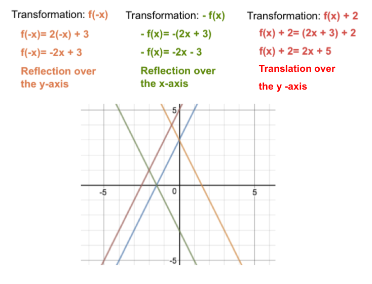
We can also use our knowledge of transformation rules to create the linear transformation rules. For example, recall that the translation of (x, y) --> ( x + 4, y) shifts or translates our points to the right 4 units (along the x-axis). Therefore, the composite function f(x+4) would perform the same linear transformation.
As a second example, a reflection over the y-axis follows the rules (x ,y) --> (-x, y) , therefore, f(-x) reflects your linear function over the y-axis.
As a second example, a reflection over the y-axis follows the rules (x ,y) --> (-x, y) , therefore, f(-x) reflects your linear function over the y-axis.
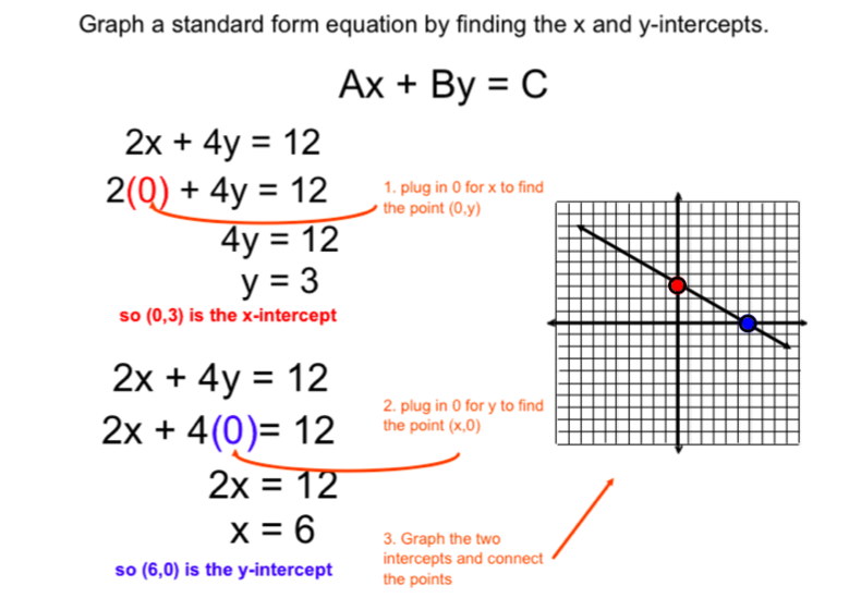
Standard Form: A form of an equation where the x and y variables (and their coefficients) are on one side of the equation, and any constants are moved to the other side. Proper standard form is written as Ax + By = C where A, B, and C are whole numbers and A is not negative.
Website explaining how to convert an equation into proper standard form
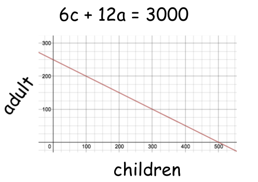
Advantages/disadvantages of standard form versus slope-intercept form. Slope intercept form is written as y=mx +b, therefore you can readily see the slope and the y-intercept. Standard form is rearranged so that you cannot "readily" see either piece, however, you can more easily find both the x and y intercepts by simply plugging in 0 for x and 0 for y. Slope intercept (y=mx+b) is typically used for equations involving a single rate and independent and dependent variables. Standard form is typically used for situations that do not necessarily depend on one another (but sometimes they both depend on one another). Standard form equations, in real life situations, do not have "one" rate. Sometimes there are 2 rates, sometimes there is none.
- For example, if children's tickets at Loews cost $6, adults tickets cost $12, and the total income earned on a Saturday night is $3000, the income of Loews can be described as 6c + 12a = 3000. Both 6 and 12 are rates (cost per person) whose ticket totals depend on one another (obviously, if you sold more children's tickets then you would sell less adults, and vice versa). It does not matter which variable you choose to place on your independent axis because technically these are both dependent variables. At right, I chose children to be my x-value.
Watch this video about 4 minutes in for a quick review on graphing a standard form equation.
Below is an example of how to graph an equation in standard form by finding the x and y-intercepts in 3 simple steps.
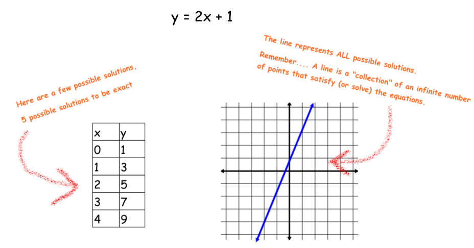
What is a graph? What is a table?: One of the most important thoughts or ideas of graphing and equations deserves its own title. What is a graph? What is a table? Quite simply, if you take an equation and make a table you are showing a table of possible x and y values that satisfy that equation. So essentially, if I solve 2x = 10 then I get x = 5 as my only solution. However, there is not just one single solution to y = 2x. The solution in this case is any pair of x and y values that satisfy the entire equation. x=0 and y=0 is one possibility, x=2 and y = 4 is another, x = 5 and y = 10 is a third.......
Therefore, a table, as explained above, is a list of some possible solutions to the equation. Obviously, we cannot put all values into a table.
A graph on the other hand displays all possible solutions to an equation (that is why we draw a line, and include arrows on each end). A graph is merely a visual representation of all of the possible solutions to an equation.
So what exactly is a line anyway?: Just like the topic above, the concept of "line" deserves its own explanation as well. What exactly is a line? Contrary to what you may think, it is actually not "a line". To imagine this, think about a table that you create from an equation.
You could say that each point in the table is a possible solution to the equation. This is similar to solving an equation like 2x + 4 = 14, however, in this 2-step equation we have only one variable, x, to solve for. Therefore, we need only to determine that x = 14. However, in a linear equation we have two variables to solve for, x and y. Each x and y value is a possible solution to that given equation.
How does this relate to graphing and tables? Look at the table above, are those values the "only" solutions to that equation? Of course not. You could create a table that includes 10 more values, or even 10 million more! You could even determine the y value when x is a value in between each whole number on the table (for example, when x = 1/2, x= .334, or x = 1.56873). You could, potentially, have an infinite number of whole number solutions, in addition to an infinite number of fractional solutions in between each whole number value. Therefore, when we graph the equation on a coordinate grid we are not simply graphing those whole number values, we are drawing a line. That line is not just "a line", it is a collection of an infinite number of points that are drawn so closely together that they "look like" a line. Each of these points could be a possible solution to the equation that represents it. Of course, you wouldn't draw an infinite number of points, you would just draw a line. :)
A line, therefore, is a visual/graphical representation of all possible coordinate points (x and y values) that satisfy the equation that the line represents.
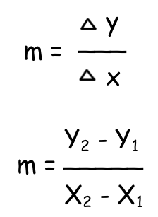
Slope: The slope of a line is the mathematical name for the rate or rate of change. We can see and calculate the slope using the line itself (on a graph), a table, or the equation. More importantly, we can find the slope of any given line if we know just two points that lie on the line.
Slope can be calculated by finding the change in y-values and dividing by the change in your x-values. Algebraically, you may see this two ways (see right):
The triangle in the first method means "change in" or difference between.
The second method actually writes out "the difference between y values" divided by "the difference between x values." For all intents and purposes, we will be using this formula in Algebra.
Slope applet
Slope explained (with easy to understand pictures)
Slope video with examples (good overview of everything we talk about in class)
Below shows how to find the slope between two points:
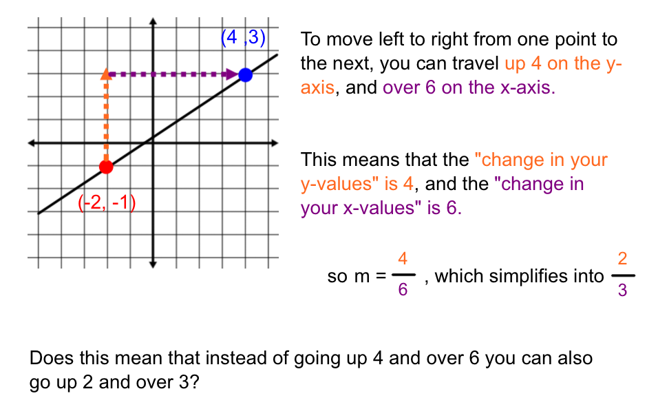
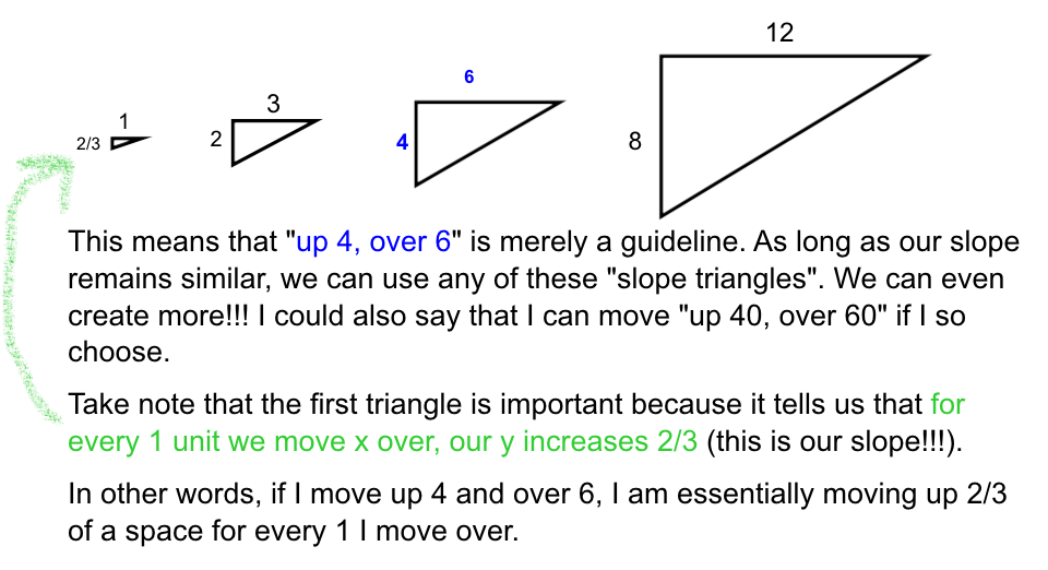
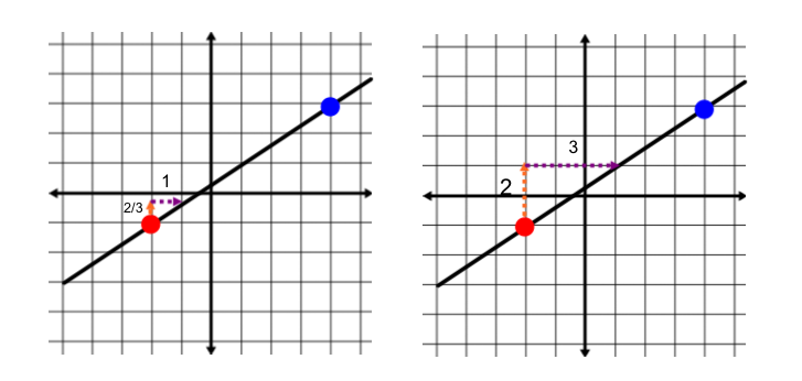
Yes!!! Absolutely!!!! Since the line above is linear it maintains a constant and steady rate at every single point on the line, NOT just the points that are "up 4 and over 6" from each other. Therefore, as long as the patterns of slope remain similar to "4/6" we can move between any point on the line!! Recall a few similar triangles that we analyzed in 7th grade:
See the graphs below to compare how this looks on the original coordinate grid:
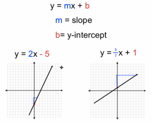
Slope intercept form of a line: The slope intercept form of a line is an equation for a line written in the form y=mx + b. That is, by looking at the equation we can readily see the slope and y-intercept. Remember, this is now "how" we write an equation for a linear line. It is simply just one form that we can algebraically write:
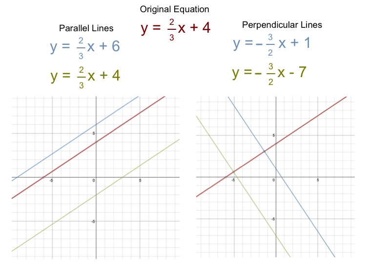
Parallel and Perpendicular lines: Two lines are parallel if they never touch, or intersect. Two lines are perpendicular if they intersect at a perfect 90 degree angle. What does this mean about the relationship between their slopes and y-intercepts?
- Parallel lines have equivalent slopes, but can have any y-intercept.
- Meanwhile, perpendicular lines meet at a perfect 90 degree angle. In order to achieve this perfect 90 degree angle, recall our 90 degree rotation rule from our transformations lesson....(x , y) ---> ( -y, x). Essentially, the x and y values switch places, and your y value becomes its opposite. In other words, if the rise is your change in y values and the run is your change in x values, then rise/run becomes "the opposite of run/rise" .To get the slope of a perpendicular line to another given line, we take the 'negative reciprocal' of the original slope. Again, the y-intercept does not really matter.
For example, lines parallel and perpendicular to y = 2/3x + 4 are shown below:
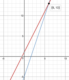
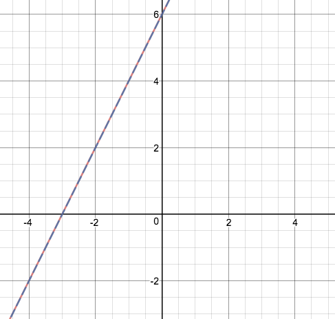
Solving Equations by Graphing: imagine solving the equation 2x + 1 = 3x - 5. Algebraically, you would solve for x and find the x-value that makes the equation true (in this case, x=6).
Now think about it this way...... if the algebraic expression 2x + 1 is equal to 3x - 5 at some point (when x=6), then that means their graphic lines must also be equal at some point.
Now check out the graph containing y = 2x + 1 and y = 3x - 5 at right:
As you can see, the two lines intersect at the point (6,13). Meaning, when x=6, the lines will be equal. Algebraically, when x=6 the two expressions are equal too. So what about the 13???? Plug in x=6 into the equation and simplify both sides. You should get 13=13. Meaning, when you input 6, both expressions are equal to 13.
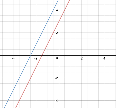
Graphing with No solution - Algebraically speaking, no solution means no values can be input into the equation to make it true. For example, we solved equations like 2x + 3 = 2x + 5 in September. Graphically speaking, this means you have y=2x+3 and y=2x+5, when graphed they are parallel lines and therefore will never intersect (AKA no solution). See below:
Graphing with No solution - Algebraically speaking, no solution means no values can be input into the equation to make it true. For example, we solved equations like 2x + 3 = 2x + 5 in September. Graphically speaking, this means you have y=2x+3 and y=2x+5, when graphed they are parallel lines and therefore will never intersect (AKA no solution). See below:
Graphing with All real numbers as a solution - as a solution means any number can be input to make it true. For example, we solved equations like 2x + 6 = 2x + 6 in September as well. Graphically speaking, you have the exact same two equations, y = 2x + 6. Therefore, you would graph both equations, one on top of the other, and they would "intersect" at every single point (AKA all real numbers are the solution). See below:
Point Slope formula: Point slope is the name of the equation derived from the formula for slope that incorporates a single point and a slope to create the equation of a line (written in simplified slope-intercept form).
When given an equation in slope intercept form, recall that you would graph this by plotting a point (specifically the y-intercept), and then using the slope to find a new point. Similarly, when given an equation in point slope form, you still plot the point represented in the formula (typically not the y-intercept, but it can be), and then use the slope to find the next point.
Point Slope help site with written examples
Point Slope help video with worked out examples
Direct and Inverse Variation:
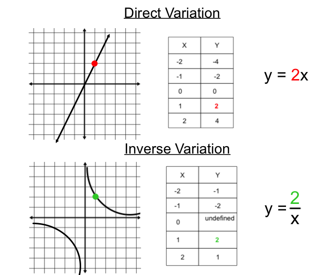
Direct variation is a linear relationship where the x and y values are directly proportional. In other words, the x value is multiplied by a common value. In other words, every point, if written as a ratio or fraction, reduces to the same common fraction. For example, in the direct variation example below every point simplifies to 1/2.
Two things to remember about direct variation:
1. The line always goes through the origin
2. The rate of the line can be seen 3 different ways (see the points in red below)
Inverse variation is a linear relationship where the x and y values vary inversely. In other words, the x value is being divided into a common number. Or, where direct variation has a value being multiplied by x, inverse variation has a number being divided by x.
Three things to remember about inverse variation:
1. The line will never go through either axis because x cannot be 0
2. The constant k can be seen 3 different ways (see the points in green below)
3. The line will be undefined when x is 0 because you cannot divide by 0.
Direct and Inverse explained (both on the same site so they have similar wording, and both with a few example problems)
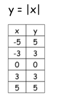
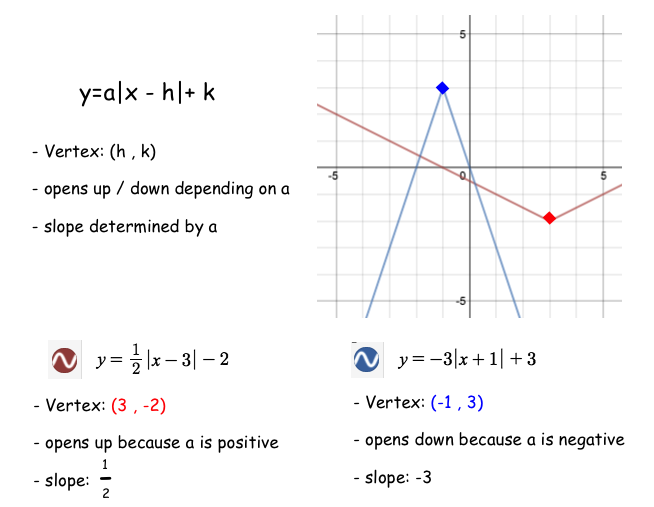
Graphing Absolute Value: When graphing absolute value equations, it is important to recall what absolute value means. It means the distance from zero, and technically we cannot have a negative distance. Therefore, the parent function y = |x| can have any number input for x, but y will always be positive. For example, if I plug in 5 or -5 for x, I will return the same value, 5, for y. See the table at right that shows this. Of course, you may have a negative y value depending on what is affecting the absolute value.
Below is the vertex form of an absolute value function with an example:
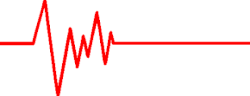
Piecewise Functions: Piecewise functions are "functions" that are created using bits and "pieces" of other functions/equations. In order to maintain their 'function' status, boundaries must be applied for each respective equation. For example, the graph of the EKG heart monitor at right is made up of 12 different lines; each with its own 'boundaries' or domain.
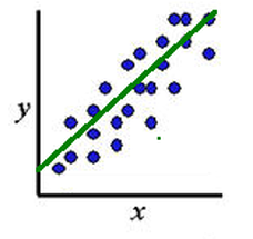
Scatterplots: A scatterplot is simply a graph made up of points. You might be thinking this is easy, and it is, but there are many more things we can do with this. The concepts explained below all stem from the various "things" we can do with a simple set of points:
Scatterplots explained
How to determine if a point lies on a line
Best Fit Line: A best fit line is an approximate linear line that fits the data. Some examples are shown below:
Interpolation: The act of estimating new data points within a previously known range. In simple terms, estimating a new point that lies between existing points. For example, suppose you have a set of 5 discrete points comparing the price of gasoline over 20 years (1960 - 1980). Then suppose you wanted to estimate the price of a date not given, but within that 20 year range.
Extrapolation: The act of estimating new data points outside of a previously known range. In simple terms, estimating a new point that lies outside of existing points. For example, suppose you have a set of 5 discrete points comparing the price of gasoline over 20 years (1960 - 1980). Then suppose you wanted to estimate the price of a date not given, but outside of that 20 year range.
Line of Linear Regression: This is your best fit line, but calculated EXACTLY (using your graphing calculator or a best fit line app). Basically, your computer takes each point and finds the slope between every pair of points. It then finds the y-intercept of each and every line between the points. Lastly, the computer finds the average slope and average y-intercept. This is the most accurate 'best fit line' for a linear appearing relationship.
Preapproved Linear Regression Calculator.
This calculator is the only calculator that I will allow on an assessment, however, be aware that there are many available online.
See the example below of 7 points that I input into this calculator:
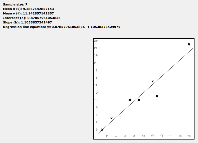
As you can see, this calculation gives you some very specific values. We are given the average (mean) x value and y value, and the slope and y-intercept of the exact best fit line (linear regression line). They even take the next step and give you a precise equation. For all intents and purposes we will simply round our values, so the regression equation is approximately y = 1.1x + .88
Use the linear regression app below to play around with the points and possible linear regression (Lin Reg) equation:
Measures of Central Deviation: This is where scatterplots really take off..... In the previous lesson, we learned how to find a best fit line. Now, we find much more. Rather than give a big long explanation, I will simply post the vocabulary we are going over for this lesson and 'simple' definitions in my own words. As a reminder, you can ALWAYS google these terms to help you create your own definition.
Causation: Is there a cause and effect relationship between two variables? If yes, then there is causation. For example, consider a graph between time spent studying and quiz grades. In general, longer study times directly affect quiz grades, or cause quiz grades to go up. Meanwhile, a graph comparing quiz grades to the length of your hair might show us some interesting results, however, one thing does not cause the other. In other words, be wary of anyone presenting this graph as 'proof' of anything.
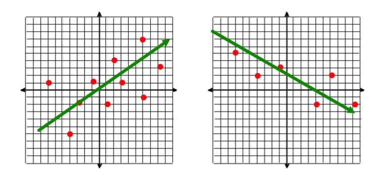
Linear Correlation: Is there a general up or down pattern that a scatterplot tends to follow? Then the x and y values must have some sort of relationship or correlation. Correlations can be linear, quadratic, exponential, logarithmic, cubic, quartic...... In addition, they can be positive or negative. You can also have "no correlation" (which means no apparent pattern or relationship), or, you can see a distinct pattern, but it cannot be represented 'linearly'.
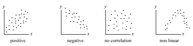
For all intents and purposes, in this chapter we are only looking into linear correlations (positive, negative, or none). In later chapters, we will examine other forms of correlation. A set of data has a "linear correlation" when the data appears to follow a 'straight line' pattern.
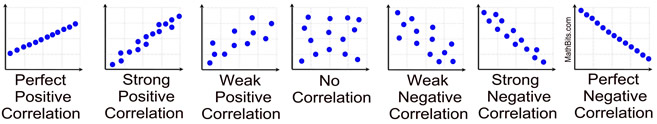
Now, just like your relationships with friends, scatterplots can have weak relationships or strong relationships. We may even have "ok" relationships that are somewhere between. Below are examples, including some wording to help you:
Correlation video
Now, just like your relationships with friends, scatterplots can have weak relationships or strong relationships. We may even have "ok" relationships that are somewhere between. Below are examples, including some wording to help you:
Correlation video
Correlation coefficient: Recall previously when you found the linear regression line? Wouldn't it be interesting if one line was 'more accurate' than another? For example, pretend you have 2 different scatterplots, Plot A and Plot B (pretend Plot A is the "perfect positive" plot from above, and Plot B is the "strong positive" plot from above). Now, Plot A has points 10 points, all of which are very close to the best fit regression line. Plot B has 10 points, but only a few are on the line, and a handful are far away from it altogether. The linear regression line for Plot A is clearly a "better fit" than the regression line for Plot B.
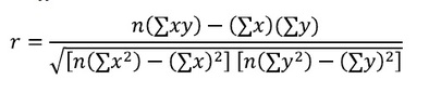
The correlation coefficient (symbolized by the variable r) is a number than tells us how good of a fit the line is. In a statistics course, you MAY be required to memorize this formula (at right). However, I am more interested in your ability to use the formula.
The value for r will lie between -1 and 1. A value of r = 1 would mean there is a "Perfect positive correlation", while r = -1 would mean there is a "perfect negative correlation". I have taken the image from above and applied "possible" r-values.
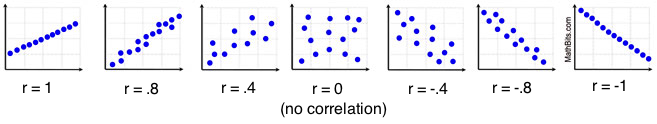
Use the correlation guess app to predict the possible correlation coefficient:
Coefficient of Determination: One of the most interesting things about the correlation coefficient is the number you get when r is squared. Your r squared value is referred to as the coefficient of determination.
For example, suppose you have the scatterplot at right, and it can be represented by the linear regression line y = .85x + 1.2, and this line has a correlation coefficient of r = .8. This means the line has a moderately strong or fairly strong positive correlation. However, when r is squared it tells us something much more interesting.
The COD is referred to as the 'proportion of variance' of the dependent variable when given the independent variable. WHat does this mean? Basically, it tells you the percentage of data that can be explained by the model you've created. In simpler terms, the COD tells us the percent chance that any given point will lie exactly on this line. Or, when you think about it another way, if you were given an extra point you now know the probability that the line will predict this new value. This is vitally important, because it essentially gives us the ability to "use" our equation, and moreover, it tells us how accurate we will be!!!
In the scatter plot at right, if r = .8, then r^2 = .64 or 64%. Meaning, that the linear regression line can explain approximately 64% of the data, or again more simply that there is a 64% chance that any given point will lie on the line.
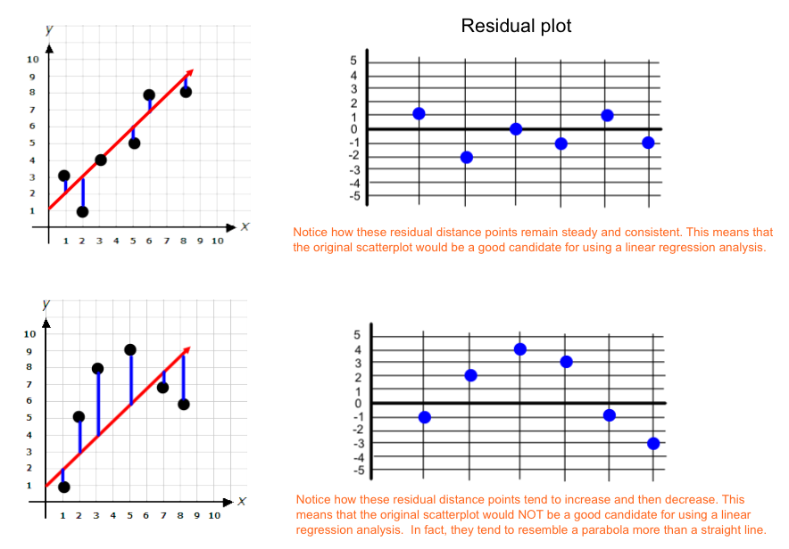
Residuals: The residuals of a scatterplot are easy to find, but can be tricky to interpret. The residuals are, simply put, the vertical distance that each point lies from the line of best fit (or linear regression line). Simple enough?
With these distances, we can do 2 important things:
One, we can find their mean or average. This would tell us the average distance that each point lies from the line.
Second, we can make a Residual Plot to help determine whether or not the data could or should be represented with a linear regression model (or if a different type of line would fit it better).
Residual Plot: This is a scatter plot that compares the residuals of a graph. Basically, you are making a new scatterplot that compares each coordinate point to the distance they lie from the Linear regression line.
Use the app below to experiment with how moving the scatter plot affects the residual plot. Note: you may also check the box marked LSRL to see the linear regression line at the same time:
Use the app below to experiment with how moving the scatter plot affects the residual plot. Note: you may also check the box marked LSRL to see the linear regression line at the same time:
1) Try to make a scatterplot that creates a perfectly straight line. Observe the residual plot.
2) Try to make a scatter plot that creates a parabola. Observe the residual plot.
3) Try to make a scatter plot that has no apparent correlation whatsoever. Observe the residual plot.
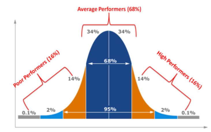
The Bell Curve: The bell curve is considered the shape of a "typical" evenly distributed data set. Think about grades in a class..... If everyone scored a 100, the test was too easy, all 40's and 50's and the test was too difficult. Ideally, I want a nice distribution of mostly B's, a few A's and C's, and a select few D's and A+'s.
Data does not always follow this exact trend, in fact, it rarely does. We are talking about data in a perfect world. To display this bell curve in class we looked at the plinko game below.
Data does not always follow this exact trend, in fact, it rarely does. We are talking about data in a perfect world. To display this bell curve in class we looked at the plinko game below.
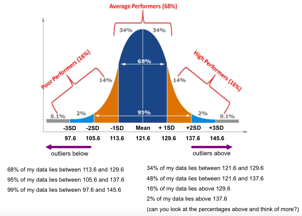
Based on the area (or the number of marbles) in the curve. We can estimate that about 68% of the marbles will land around the "middle". 95% will land just to the side of the middle, and 99% will land within the edges (technically 100%, but mathematically nothing is ever 100%). These percentages come into play later on with Standard Deviation.
Standard Deviation: Standard Deviation is simply a way to measure the dispersion or variability in a group of data. Recall from 7th grade when we learned that we could use Mean Absolute Deviation to show how consistent a set of data is (for example, Student A has grades of 50 and 100, and Student B has grades of 75, and 75. Both have a 75 average, but Student B is more consistent). We used the MAD to show the variability of the data by find the distance between the mean and each data value, and then absolute valuing those distances (hence Mean ABSOLUTE Deviation).
Standard Deviation is similar to the MAD, however, instead of taking the absolute value of each distance you square each distance instead. This squaring process accentuates larger distances more than smaller distances (for example, a distance of 3 would become 9, while a distance of 6 would become 36, which is much larger than 9). We would then find the average of these squares (this is called the "variance" of a data set), and then square root it. Why square root? We would square root the variance because technically speaking we squared each number to begin, therefore we would square root your average square (variance) once we are done calculating.
The Standard Deviation alone is simply a number. What is most impressive, and important, is what the number can do for our data. It provides us with a way to apply percentages (or probability) for prediction purposes, and it also gives us a way to calculate outliers.
We discovered in class that outliers lie 2 SD's away from the mean
Also, based on the area under the bell curve, approximately:
-68% of data will lie within 1 SD from the mean
-95% of data will lie within 2 SD's from the mean
-99% of data will lie within 3 SD's of the mean
For example, suppose the following scores are IQ scores for students in an AP Physics class.
116, 117, 118, 118, 119, 120, 120, 121, 122, 145
Upon inputting them into my standard deviation calculator I receive a Mean of 121.6 and an SD of 7.99 (which I will round to 8). See below how this applies to the bell curve, and what inferences I could make: